EURONEXT
Euronext N.V. (European New Exchange Technology) is a European stock exchange with registered offices in Amsterdam and other markets operated in Brussels, London, Lisbon, Dublin, Oslo, and Paris.
In 2019, Euronext is the largest stock exchange in continental Europe with 1,300 issuers representing a €3.8 trillion market capitalization. Its total product offering includes equities, exchange-traded funds, warrants and certificates, bonds, derivatives, commodities and indices as well as a foreign exchange trading platform.
Job title and description
I joined Euronext as the Web Innovation Intern.
As such, I participated in two projects: the launch of Euronext’s new Web Ecosystem and the Digitalization of the Membership Onboarding Process. I was part of the Web Team which was comprised of two senior members, one consultant and me in Paris, one senior and another intern in Amsterdam, and one junior employee in Porto. We worked with two third-party companies, one Design agency that created most of the elements and the design system I used, and one development and hosting company. I wrote my Master Thesis during my time at Euronext, you can download it here.

My awesome bosses and me
Digitalization of the membership onboarding process
The Membership Onboarding Process is one important process of Euronext since it is the process the Members of Euronext (a big part of its Customers) perform to access the different markets available at the exchange. Since Euronext is first and foremost a Stock Exchange, this process is critical and digitalizing it presented multiple benefits. Mainly reducing the workload and time spent by the members of the MCC (Membership and Customer Connectivity) Team and improving the User Experience of the customers or the Customer Experience.
In order to improve this, the MCC Team proposed a project for its digitalization in 2017. The process for the potential Members or current Members consisted of having to call the MCC Team requesting access to any of the Markets that are managed by Euronext, then the MCC Team would send them the required forms that needed to be filled out depending on the many possible conditions of the request. Afterwards, the member would fill the forms and send them back through e-mail or regular mail to be reviewed by the MCC Team. If any errors were found the forms needed to be refilled by the Member. Once the whole form filling process was finished and signed by the appropriate signatories, a member of the MCC Team had to type up all of the information provided by the customer into the internal software in order to save the information into the system and give access to the user.
TLDR: it was too long and cumbersome.
User-Centered Design Process
I followed the User-Centered Design process as closely as I could during my internship. I started by researching the information and data that had already been collected about the project. This included business requirements and a proposed workflow. I proceeded to iteratively design the workflow and user interfaces of the solution by testing them with members of my team and members of the MCC team that were the intended users of the solution. The solution is intended to be used by two different sets of users. I had direct access to the MCC team but due to time constraints I couldn't test with any external users, that also required different user roles; As knowing whom you are designing for is a critical factor of User-Centered Design, I took into account the main distinctions between the roles to classify them. My initial intention was to create Personas but due to the wide variety of users and the lack of specific information about them, I wasn’t able to.
This was all done in paper first and then on Figma.

The user-centered design process based on ISO 9241-210:2010
Workflow design
I originally designed multiple different cases trying to take into account all possible outcomes, but after some discussions with my supervisor we decided to make only one and add the exceptions as possible branches. I started out doing quick and dirty paper versions and then I would make them properly on Figma. Then I would repeat the same process to adapt to the feedback and new ideas that came up through the user tests and interactions with the MCC Team.
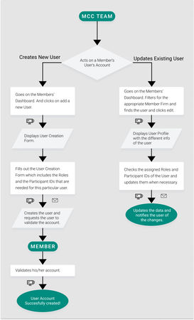
As can be appreciated in the final version below, the idea was to keep it as simple as possible and to make sure the states relate to the status that will be displayed to the user. For the final version, only one outcome is possible because there is always just one possible outcome (the request is completed). It was very important to keep the workflow updated and simple because it defines the possible actions and in some cases, it reacts automatically to stimuli. The workflow was programmed in the website using Drupal’s Workflow module, which lets the developer program actions and reactions to different stimuli. For example, once the form has been reviewed and approved for signature, the system triggers DocuSign’s process and waits for its completion to let the user do the next step.
This process was very interesting and is one of the aspects of Product and UX design that I enjoy the most. It was also quite challenging because the many possible exceptions had to be ignored as much as possible to keep the whole system simple, but they needed to be taken into account so as not to cause problems in the future.
First workflows where I divided the different actions
From left to right the progression of the workflow until the latest version
User Interface design
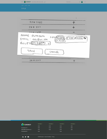
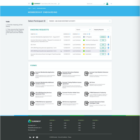
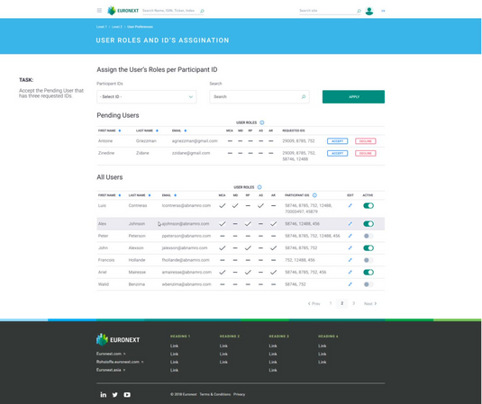
I created very basic paper prototypes of the sections my supervisor and me decided to create and used them to validate ideas with the MCC Team. The sections were: Membership Details, Create New Account and User Preferences, Membership Onboarding Dashboard, and User Roles and IDs Assignation. Out of these sections, the only one involved in the workflow explained before is the Membership Onboarding Dashboard, the other sections are related to user profile permissions and editing.
The MCC Team member who saw these very basic paper prototypes agreed to the ideas behind them and helped with defining how to proceed. After this the whole iterative process of designing, testing, validating, getting new requirements, and repeating begun. I created different prototypes on Figma including a fully interactive one for the last few tests. For the user tests, specific tasks that changed throughout the different iterations were requested to be achieved by the user, and questions were asked after the test was finished. The questions, contrary to how it was planned, changed a lot depending on the screen being tested at the moment and they ended up being conversations more than interviews. Originally using a SUS questionnaire was planned but it was discarded as it seemed like a waste of time for the user and would not be properly filled by him/her.
To take into account the external users, as mentioned before, I categorized them: the first category of users required a lot of editing power over other users and requests but with as little interaction necessary as possible with the system (high-level managers); the second category of users require a fair amount of editing power over other users with lots of interaction with the system (mid-level managers); and the final category of users require no editing power over other users at all, only over the requests, so they needed to be as intuitive and simple as possible (assistants, interns, and other lower-level employees). On the other hand, the MCC Team version of the sections, needed power over everything and everyone so the designs ended up being quite different from the ones for the Members for two of the sections. The good thing about this was that the MCC Team was part of the process so it was easier to design accurately for them. Especially taking into account that at the roll-out of the project, only the MCC Team version of things will be launched and then gradually the customers will be included in the new process, once it has been tested and proven.
First quick and dirty paper prototypes
Some more advanced paper prototypes
The final version of the prototypes
Launch of Euronext's new web ecosystem
Euronext decided to change their old many websites that were even different depending on the language and consolidate them into three: one for marketing, one for members, and one for financial data. I performed many different tasks and activities related to the successful launch of Euronext’s new Web Ecosystem. Due to the time constraints, deadlines, budget, management of third-party developers and designers, and because I joined on the final stages of the project, many aspects of the User-Centered Design process were overlooked or handled differently. Many trade-offs were also necessary; many elements were accepted without the desired quality standards to deal with the most critical issues or “Blockers”.
Prioritization of issues, redesigns, and other aspects of the process were necessary for this. I was mainly in charge of UI design and redesign, as well as Usability and UX analysis of both the desktop and mobile versions of the website and QA. As well as putting into place certain safeguards for the early stages of the launch and google analytics reports for the later ones.
User Interface design
For this project I couldn't perform many user tests, because we were against the clock. In these cases, what I did was design something show it to the members of the team individually to have their unbiased opinions and react to their feedback, and then deliver on Jira the needed development and which elements to use from the design's agency design system. In some cases I adapted the design of pages that were not designed by the agency, in these cases I took more time and more iterations to reach a final result.
Some old versions
Quality assurance
We used a google sheet with the issues that needed analysis and the distribution of tasks between the team. And after finding the issues and prioritizing them we proceeded to add them as tickets on Jira to be handled by the developers with a description of the issue and its priority. A big part of it was also analyzing the mobile experience and proposing changes to optimize it. To do this I did competitors' and best practices research, like for the case of using a horizontal scrollbar, which we ended up doing, by having it always displayed.
This was super interesting because I ended up taking some of the project management responsibilities. Since I defined the priorities of the tickets and discussed directly with the developers and designers.
Some new versions designed by me
Plans for after the launch
We added a Solr search (keyword search) on the 404 page I designed. We also added a preselected list of the most important pages in order to make it easier for users that were used to the previous navigation.
In conjunction with the 404 page, a Google Analytics report was used to find the source of the 404 pages and be able to tackle them and redirect them properly when possible, as it had been done before for other pages. A full site redirection from the previous pages was done using RegEx to account for links available on other websites, documents, and search results from google at the beginning. This proved quite useful, the number of 404 pages was quite small.
While using Google Analytics to create the 404 reports, I also started creating other reports that could be useful for the project in cooperation with my supervisor.

404 Page
Lessons learned
These two projects helped me get a very good notion of how projects in the digital realm are performed inside of a company. These two projects helped me get the whole overview of a full project. I started out on the final stages of deployment and QA of a project, and then I led the first stages of another project: since the user requirements gathering until the delivery of development requirements to the programmers. The stages that I didn’t take part in one I did on the other. The scope, impact, and workload of the first one was much larger and so proved to be more time-consuming and less open to much innovation. In both cases, simplicity was key, because the users are widely varied from different backgrounds and so the systems needed to accommodate all of them. I truly enjoyed taking part in both projects.
I would like to wholeheartedly thank Stephane Clediere and Ariel Mairesse for giving me this opportunity. It has truly helped me grow and I learned a lot about the kind of projects I would like to take part in the future and how to tackle them properly. There was always a very collaborative and supporting atmosphere that helped make the work great and fun.


